MANGO Connects
Tools & methods: Heuristic Analysis, Usability Testing, Prototyping, Axure
Overview
My team was asked to conduct usability testing on the network organization platform MANGO Connects. This project was an excellent experience that helped me further develop skills in conducting usability testing. Some methods we used:
Usability review (heuristic analysis)
Remote testing
Lab testing
As a result of the usability testing, 3 areas for potential improvement were located that could increase usability, eliminate confusion, and increase overall user satisfaction.
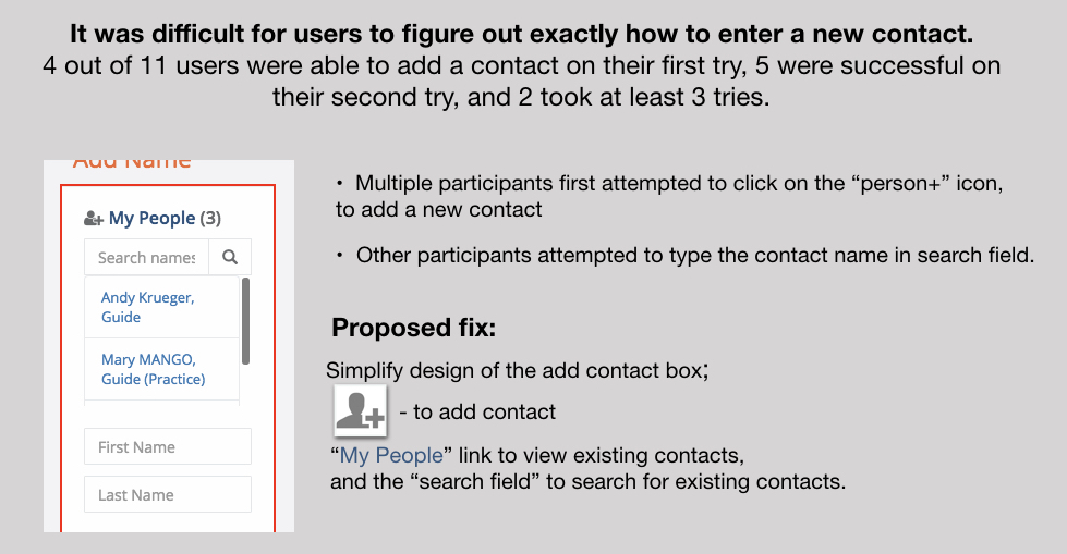
Those 3 areas are highlighted below. Here's a quick Axure walkthrough of my proposed change for simplifying the "add contact" box: MANGO Connects Prototype
Proposed Site Improvements
Understanding The Platform From A User Perspective
As previously noted a few different methods of research were employed to gain these findings. I began the process by conducting a usability review of the site. Some things I found:
Sign-up was easy, was the confirmation email necessary?
The prepared questions feature seemed useful but I wasn’t sure what to do with the questions
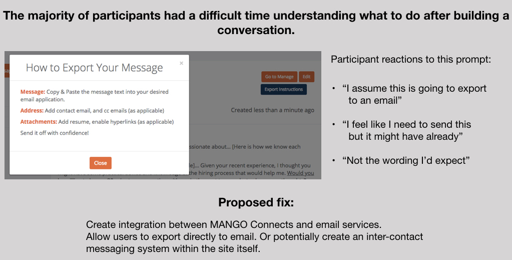
The message builder feature seemed useful but I wasn’t sure how to send a message
It might be difficult to recognize a contact without their employer listed
Here's a table listing each problem, a severity ranking, and what Nielsen design principal it violated:
Testing The Platform With Users
Next, along with a group of fellow designers, we conducted a series of usability tests with a group of 11 participants. 8 were done remotely and 3 were done in a lab.
An incredible amount of data was obtained from these tests. Some of it confirmed problem points I had found in my previous review. Other important flow issues were uncovered and many of the positive features of the site were also highlighted.
After documenting all of our raw data, we began synthesizing the information. The goal was to organize it into like categories and identify meaningful patterns as areas began to cluster.
Pain Points
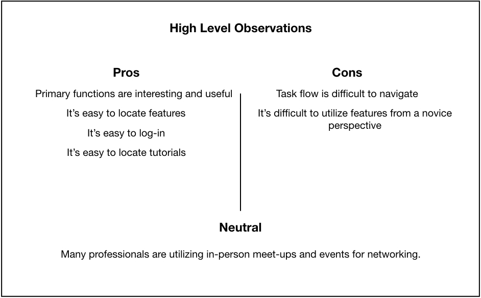
Taking what we learned from the research I was able to make some high level observations about the site and list them out as pros and cons. In addition, I was also able to locate some pain points in the task flow. They were as follows:
Entering a new contact
Sending a message
Using prepared questions
After identifying the problem, I looked back to the issues test participants had with these functions and was easily able to offer the previously noted proposed fixes.
Conclusion
Overall there are a lot of useful features on this site. Integrating a simple communication bridge between contacts can increase usability, eliminate confusion, and increase customer satisfaction.


